Categories
Vanilla 1.1.4 is a product of Lussumo. More Information: Documentation, Community Support.
CD COVERS | The good, the bad and the ugly
-
- CommentAuthorDemetris
- CommentTimeSep 8th 2014
fucking.hell.http://9gag.com/gag/aQpxP6qLove Maintitles. It's full of Wanders. -
- CommentAuthorThor
- CommentTimeSep 8th 2014
Demetris wrote
fucking.hell.http://9gag.com/gag/aQpxP6q
Ha, ha...
Many of those I've seen before, like the Heino thing. They frequently pop up on lists of the worst album covers of all time.I am extremely serious. -
- CommentAuthorThor
- CommentTimeSep 8th 2014 edited
I think they could have done better than this cover for the brand-new TEARMS OF ENDEARMENT CD from Quartet:
http://www.quartetrecords.com/media/cat … arment.jpgI am extremely serious. -
- CommentAuthorTimmer
- CommentTimeSep 8th 2014
Thor wrote
I think they could have done better than this cover for the brand-new TEARMS OF ENDEARMENT CD from Quartet:
http://www.quartetrecords.com/media/cat … arment.jpg
Holy Baby Jesus on a live powerline!!! That is NASTY!!!!!On Friday I ate a lot of dust and appeared orange near the end of the day ~ Bregt
 -
- CommentAuthorFalkirkBairn
- CommentTimeSep 8th 2014
I am sure that someone could come up with a better version.The views expressed in this post are entirely my own and do not reflect the opinions of maintitles.net, or for that matter, anyone else. http://www.racksandtags.com/falkirkbairn -
- CommentAuthorFalkirkBairn
- CommentTimeSep 16th 2014
Screamworks has a CD coming out at the end of September, Bad Milo (Ted Masur).
The CD cover is based on the general film artwork and I think that it's terrible:
http://ia.media-imdb.com/images/M/MV5BM … 17_AL_.jpgThe views expressed in this post are entirely my own and do not reflect the opinions of maintitles.net, or for that matter, anyone else. http://www.racksandtags.com/falkirkbairn -
- CommentAuthorDemetris
- CommentTimeSep 16th 2014
this? http://www1.screenarchives.com/largeImage.cfm?TID=28038Love Maintitles. It's full of Wanders. -
- CommentAuthorFalkirkBairn
- CommentTimeSep 16th 2014
Demetris wrote
this? http://www1.screenarchives.com/largeImage.cfm?TID=28038
That's the one!The views expressed in this post are entirely my own and do not reflect the opinions of maintitles.net, or for that matter, anyone else. http://www.racksandtags.com/falkirkbairn -
- CommentAuthorDemetris
- CommentTimeSep 16th 2014
wow that is hideous!!!Love Maintitles. It's full of Wanders. -
- CommentAuthorTimmer
- CommentTimeSep 16th 2014 edited
Wad d' fffff.... That's NASTY!On Friday I ate a lot of dust and appeared orange near the end of the day ~ Bregt -
- CommentAuthorThor
- CommentTimeSep 16th 2014
Ha, ha....indeed.I am extremely serious. -
- CommentAuthorEdmund Meinerts
- CommentTimeSep 16th 2014
KILL IT with fire!!!
-
- CommentAuthorErik Woods
- CommentTimeSep 17th 2014
Thor wrote
I think they could have done better than this cover for the brand-new TEARMS OF ENDEARMENT CD from Quartet:
http://www.quartetrecords.com/media/cat … arment.jpg
They didn't have much to work with. Here's the one sheet.
http://images.moviepostershop.com/terms … 233696.jpg
-Erik-host and executive producer of THE CINEMATIC SOUND RADIO PODCAST | www.cinematicsound.net | www.facebook.com/cinematicsound | I HAVE TINNITUS! -
- CommentAuthorFalkirkBairn
- CommentTimeNov 17th 2014
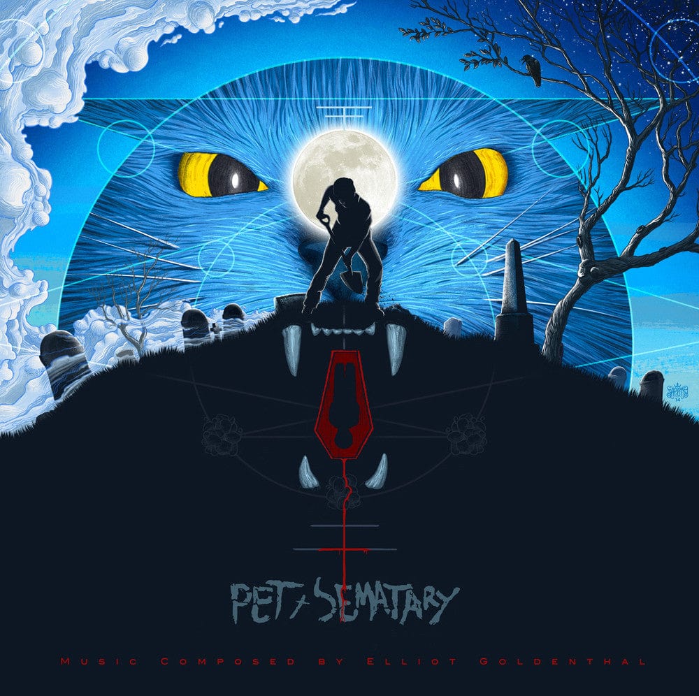
As with a lot of the album covers that are with recent vinyl re-releases of film scores, Mondo's album for Goldenthal's Pet Sematary may be art but it's not what I'd call a nice piece film score artwork:
http://cdn.shopify.com/s/files/1/0558/2 … 1414695476The views expressed in this post are entirely my own and do not reflect the opinions of maintitles.net, or for that matter, anyone else. http://www.racksandtags.com/falkirkbairn -
- CommentAuthorTimmer
- CommentTimeNov 17th 2014
FalkirkBairn wrote
As with a lot of the album covers that are with recent vinyl re-releases of film scores, Mondo's album for Goldenthal's Pet Sematary may be art but it's not what I'd call a nice piece film score artwork:
http://cdn.shopify.com/s/files/1/0558/2 … 1414695476
It looks more like the cover to some prog-rock or jazz album rather than a film score.
not good at all.On Friday I ate a lot of dust and appeared orange near the end of the day ~ Bregt -
- CommentAuthorSteven
- CommentTimeNov 17th 2014
I like it. A lot! And I love the Interstellar artwork too. -
- CommentAuthorCaptain Future
- CommentTimeNov 17th 2014
^ Jawohl!Bach's music is vibrant and inspired. -
- CommentAuthorTimmer
- CommentTimeNov 17th 2014 edited
Steven wrote
I love the Interstellar artwork.
I agree!
I usually really like Erik's work but on this occasion I far prefer the official album release art.On Friday I ate a lot of dust and appeared orange near the end of the day ~ Bregt -
- CommentAuthorErik Woods
- CommentTimeNov 18th 2014
The official INTERSTELLAR cover art is putrid. Awful fonts, awful colours, awful logo. It's poorly done, IMO.
-Erik-host and executive producer of THE CINEMATIC SOUND RADIO PODCAST | www.cinematicsound.net | www.facebook.com/cinematicsound | I HAVE TINNITUS! -
- CommentAuthorEdmund Meinerts
- CommentTimeSep 13th 2015
The cover for Powell's Pan is out and it's an eyesore and a half! Oversaturated shiny lens flare garbage.
-
- CommentAuthorCaptain Future
- CommentTimeSep 13th 2015 edited
My already low expectations for this film have just been lowered even further. I can sense James M. Barry turning in his grave like a cardan shaft. The score will probably be the best thing about this film.
VolkerBach's music is vibrant and inspired. -
- CommentAuthorThor
- CommentTimeSep 13th 2015
Edmund Meinerts wrote
The cover for Powell's Pan is out and it's an eyesore and a half! Oversaturated shiny lens flare garbage.
Yikes, that's bad! What happened to the excellent cover I've seen around the internet, with the floating ship and the moon and stuff?I am extremely serious. -
- CommentAuthorErik Woods
- CommentTimeSep 13th 2015 edited
Edmund Meinerts wrote
The cover for Powell's Pan is out and it's an eyesore and a half! Oversaturated shiny lens flare garbage.
Not as bad as the X-Men: First Class poster but still utter shit!
-Erik-host and executive producer of THE CINEMATIC SOUND RADIO PODCAST | www.cinematicsound.net | www.facebook.com/cinematicsound | I HAVE TINNITUS! -
- CommentAuthorSteven
- CommentTimeSep 13th 2015
Jesus. Drew Struzan is rolling in his grave... and he's not even dead! -
- CommentAuthorEdmund Meinerts
- CommentTimeSep 14th 2015
Erik Woods wrote
Edmund Meinerts wrote
The cover for Powell's Pan is out and it's an eyesore and a half! Oversaturated shiny lens flare garbage.
Not as bad as the X-Men: First Class poster but still utter shit!
-Erik-
I see your awful X-Men: First Class poster and raise you an even more awful X-Men: First Class poster! -
- CommentAuthorEdmund Meinerts
- CommentTimeFeb 23rd 2016
Stumbled across this recently. Dreadful movie but I had forgotten just how eye searingly UGLY it is.